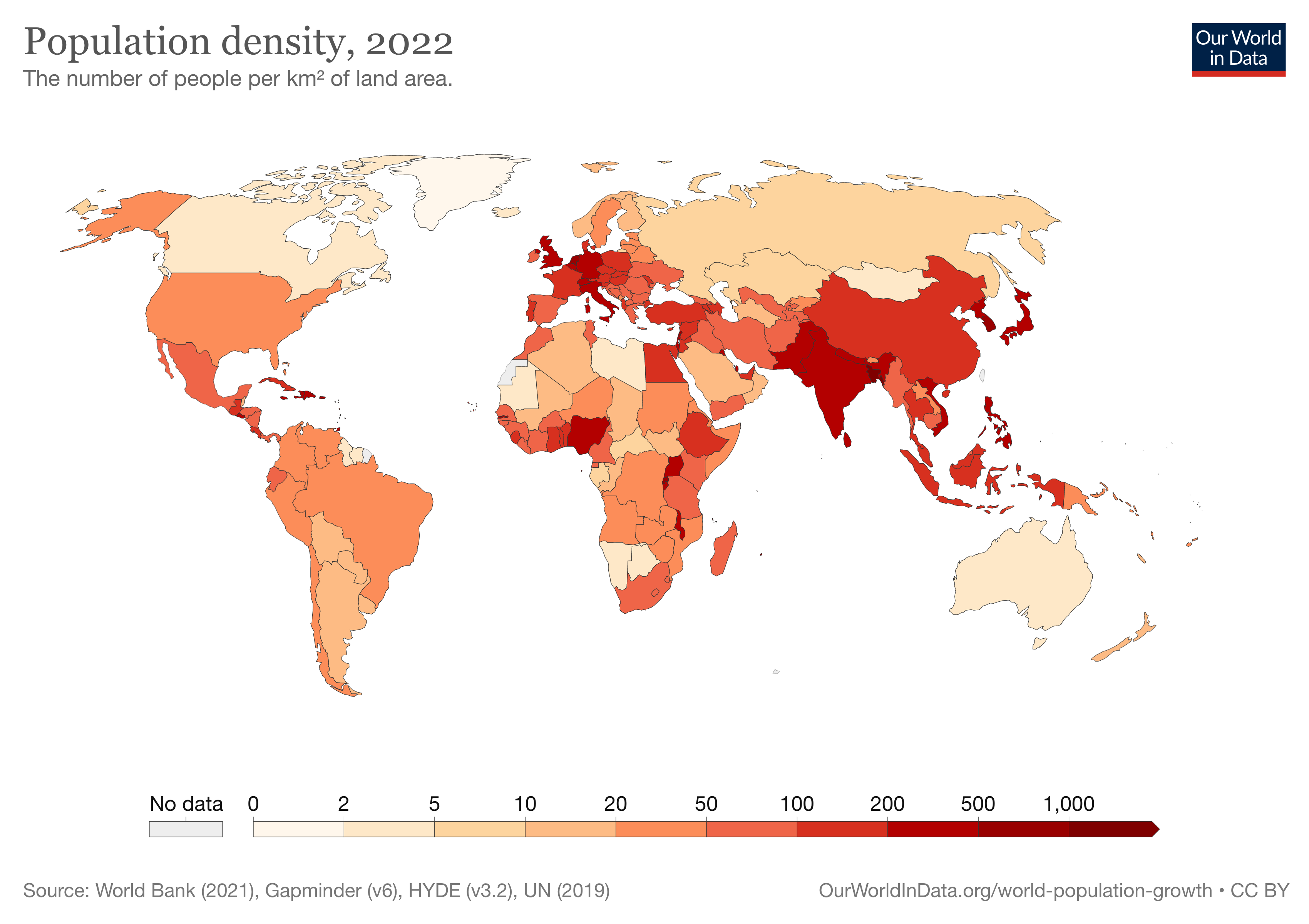
Figure 1. Choropleth Map - Population Density 2022
About Choropleth Map
'Choropleth' word comes from Greek
χῶρος (choros) = 'area/region' and
πλῆθος (plethos) = 'multitude' (from Wikipedia)
The choropleth map is one of common thematic maps.
This map uses visual variable color value
to visualize quantitative data.
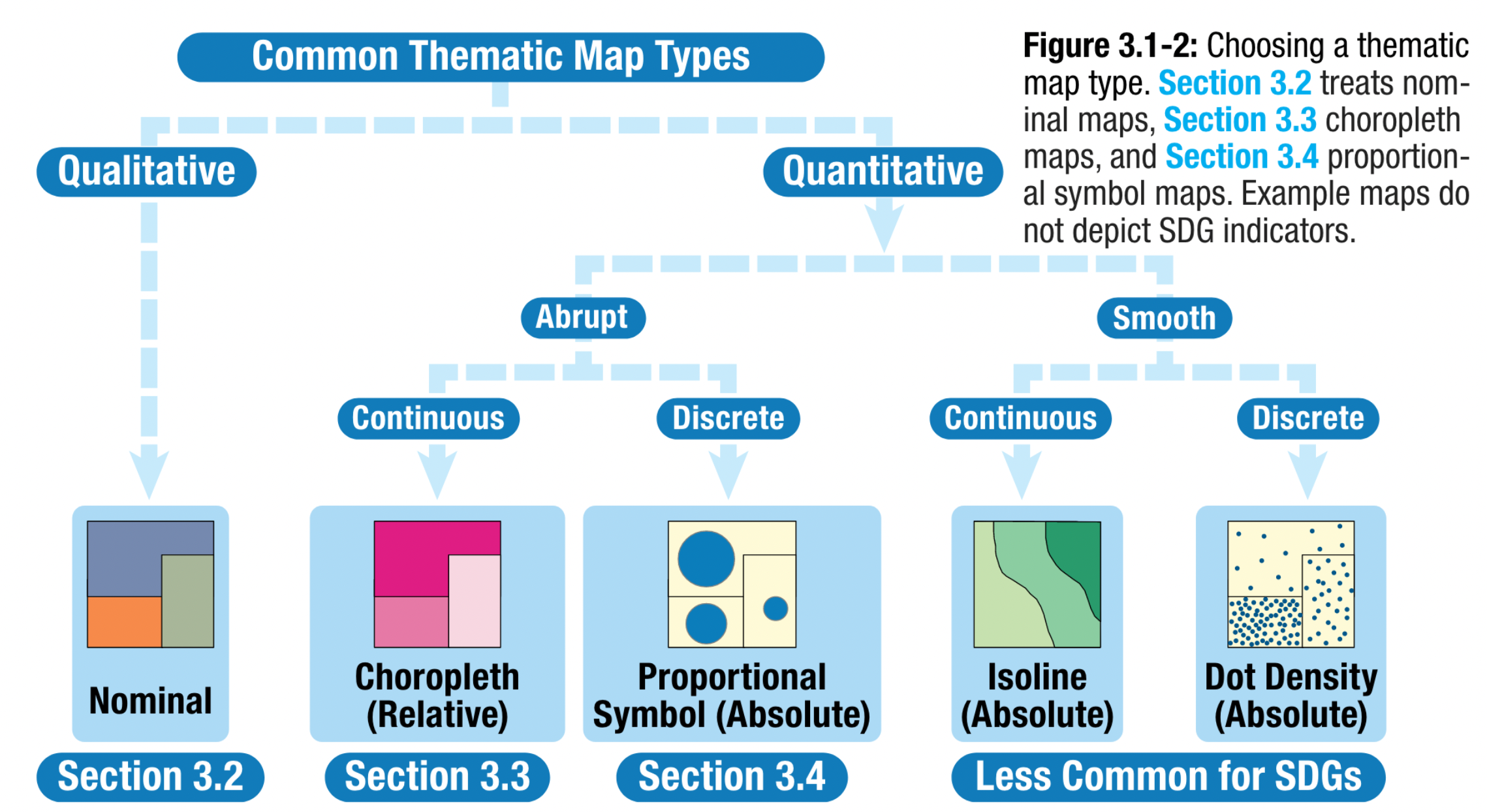
Figure 2. Common Map Types from
Kraak MJ, RE Roth, B Ricker, A Kagawa, and G Le Sourd (2020)
Choropleth Map Data
From the previous section, we have learnt about data type just like it is shown in Figure 2. A choropleth map is used to represent Quantitative Data
As it says in the figure on the left, we can visualize 'Abrupt - Continuous' data in a choropleth map.
Here is the examples of the data for A Choropleth Map:
→ Population density, forest coverage percentage per cities, poverty index of a specific region
Choropleth Map Color Scheme
As you can see in Figure 3 beside, color scheme is one of the most important cosiderations of making a Choropleth Map.
There are two main color scheme:
- Sequential (Single-hue or Multi-hue)
- Diverging 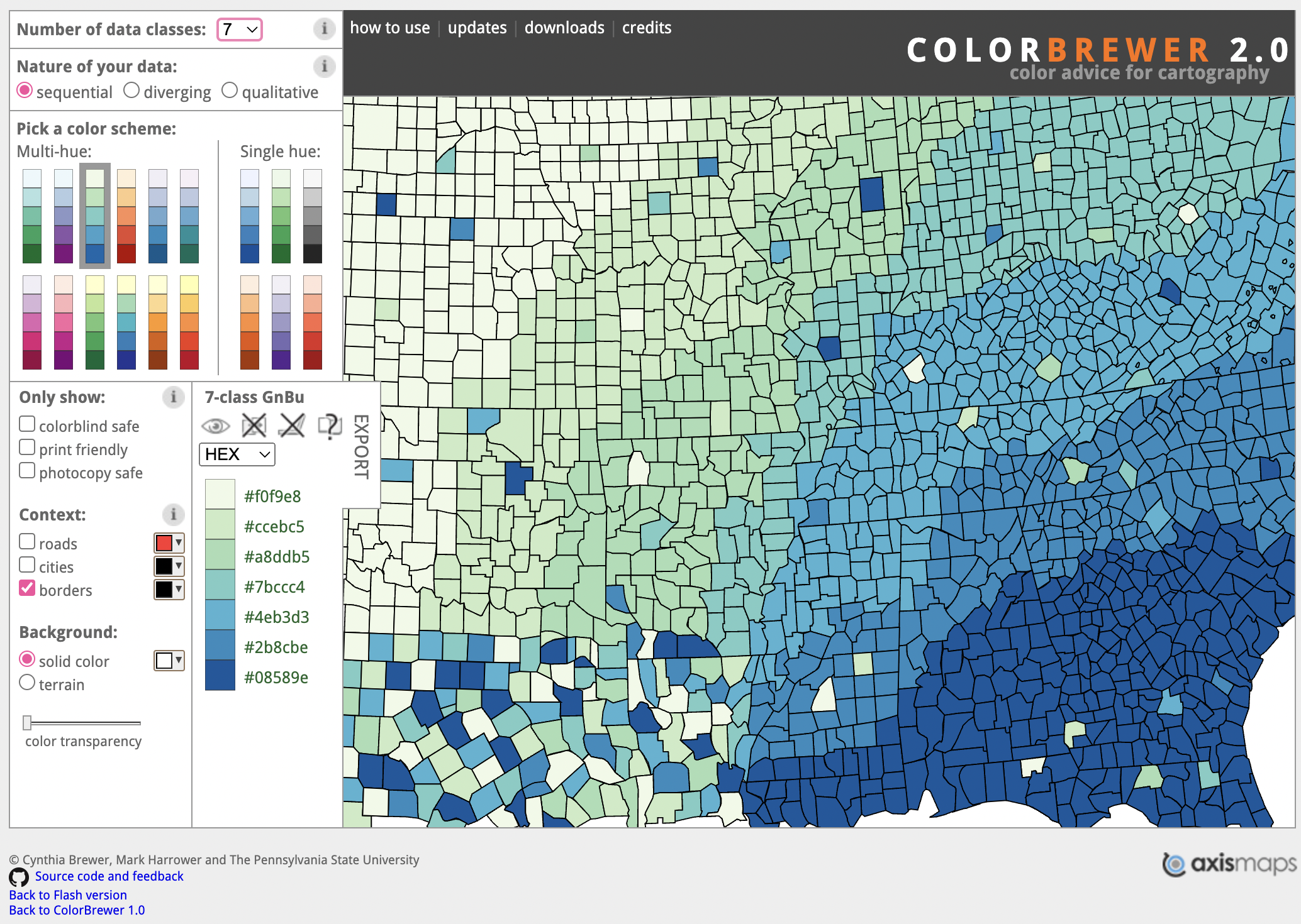
Figure 3. Color Brewer 2.0
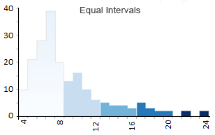
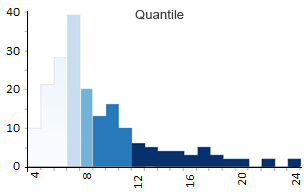
Figure 4.
Difference between equal interval and quantile histogram
for choropleth data classification
Choropleth Map Classification Method
From Figure 3, we can conclude that data classification methods can affect the appearance of the Choropleth map. There are several methods that can be used to classify data before it is visualized into a map, namely:
-Equal Interval
-Quantile (Equal Count)-Natural Breaks (Jenks)
-Standard Deviation
-Pretty Breaks
Create a Choropleth Map
create freely, change your data and color scheme to see the difference affected by both
Data Description⬇️
will be shown once you select the data
Quiz #3: Choropleth Map
Next Prev Try Again Good Job! Learn other maps?
I understand, go to "Map Elements"
Hi! R U stuck here? Please contact me 😉⬇️
Which Map Type Do You Want to Learn Next?
| # | Thematic Map Type | Data Type | Symbol dimensionality | Most commonly applied visual variable | 1 | Choropleth Map | Quantitative | Area | Color value |
|---|---|---|---|---|
| 2 | Proportional Symbol Map | Quantitative | Line (bars), Area, Volume | Size |
| 3 | Flow Map | Qualitative and Quantitative | Line | Size or Color Value (when representing magnitude) |
References
Kraak MJ, RE Roth, B Ricker, A Kagawa, and G Le Sourd. 2020. Mapping for a Sustainable World. The United Nations: New York, NY (USA).
Data Reference: United Nations Sustainable Development Goals Data Portal
Further Data Visualization Tutorial: Mapping for a Sustainable World - QGIS technical supplement
